How to choose tea ware - Perspectives on Porcelain Appreciation Part. 1
Hello everyone, this is my third blog, and I am making this blog in a very critical manner, because I find that there is very little knowledge about analyzing porcelain (especially tea set porcelain) on the English Internet. In this blog, I will output my opinion with an objective attitude and the support of knowledge. However, I would like to emphasize that for subjective reasons, different people will have different ways of analyzing, which makes it difficult to say which appreciation perspective is perfect. If this article inspires you, it will be my greatest reward.
I would like to urge everyone to “please please please yourself in your own aesthetic way”, we don't need to be told what we need to buy by complex narratives or highbrow rhetoric.
As a tea ware maker and seller, I also tell myself that if I can't provide something that people enjoy, then there's no point in making or selling it.
Make something good without bullshit.
In this blog, I will dissect how we can appreciate the tea set from the perspective of making ceramics. Based on the history as well as the modern way of making, we can roughly summarize the process of making a porcelain: pre-firing - painting (carving or painting patterns) - glazing --Firing --Painting --Color firing --Finished product.
This production process also demonstrates the dimensions of our appreciation,
namely: 胎tire / 型type / 釉glaze / 彩color / 绘painting / 烧firing
Explained in English, these are the six dimensions of examination:
raw material/shape/glaze/color of raw material/surface pattern/firing process.
胎Tire: the clay used to make porcelain.
The three clays on the market contain all the porcelain, they are:高白泥 high white clay, 仿古泥 antique clay, 陶泥 pottery clay
Characteristics:
-
High white clay emphasizes the porcelain produce white and translucent, giving a light and transparent feeling.

-
Pottery clay emphasizes the heavy and rough feeling.

Antique clay emphasizes the softness, quietness and gentleness of the product.
In the current Chinese market, due to the exquisite antique collection culture, the market prefers antique clay, but is antique clay better? I don't think so, as I mentioned before, good or bad doesn't depend on the raw material, but the feeling it brings you.
In 2000-2016, high white clay was the market's choice (as it was known as a quality label at that time), but now that wabi-sabi style is becoming a trend, people will focus on pottery clay teacups. So just like fashion, popular aesthetics are a cycle.
For example, antique clay: Its requirement for quality lies in the smoothness and calming qualities of the surface of the object, as well as sufficient light transmission. Smoothness is a requirement for aesthetics, while translucency requires the producer to have skillful and superior craftsmanship, so that the product will be called top quality in the industry. (Even on specific wares, we usually require that the finished product not only have the previously mentioned standards, but also have a faint reddish color on the exterior, a firing technique possessed by the Guan kilns I mentioned earlier, and a pain point that is difficult to replicate in fine porcelain.)
型Type: The Skeleton of Porcelain
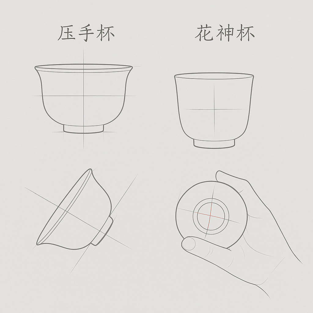
I've picked a relatively classic cup shape as an example: 压手杯 the pressed hand cup, which is a classic tea tasting cup. As you can see in the picture below, it tends to give people a heavy, stable visual impression, so how does this feeling come about?

1 The belly of the cup shape, the lower part of the cup has a falling design, so this shape will give people a rounded, full of power visual experience.
2 The bottom of the cup has an open design, which strengthens the structural support.
3 The design of its cup mouth also has the design of outward turning, but the angle will not be very large, so that people feel a kind of introverted temperament.
With these three features, it brings us the visual stability of the overall structure, compared with other teacups, he is more able to bring a sense of strength. At the same time, because of its design features, when people pick it up, they will obviously feel the downward force from the hand (especially between the index finger and thumb), which also makes it more stable in the hand, thus giving people a sense of security.

The second cup I would like to introduce is 花神杯 the Flower God Cup, which I chose because, also as a tea cup, it has almost the opposite qualities to the Pressed Hand Cup in that it emphasizes lightness and movement.

Its design basically does not have a large amount of lines and shapes, but relatively light lines, giving a kind of upright and upright temperament, at the same time in the quality of the materials used to emphasize the high translucent, in the light shining, appear tall, light. As if independent in the peak of the gentle woman.

The third is 鸡缸杯 the chicken bowl cup, its height is usually shorter than the other two types of cups about 2 cm, but also because of its height design features, he fused the design features of the above two types of cups, to achieve the straight in the curved, curved in the straight features, highlighting the Chinese culture emphasizes the introverted character traits, if you want me to choose, the chicken bowl cup is an expression of the majority of the Chinese people in the heart of the true portrayal as well as the character traits of the cup type, mediocre but There is something inside.

In the exploration of the type, the good or bad of a tea cup needs to be a blend of form, perception, and charm, although there is no standard answer, but with the basic design logic, we can also know from the type of cup whether the design of a tea set is consistent with the finished product, so usually a cup that meets the above design requirements we would call it a good design. So an artifact that combines practicality and aesthetics is a good artifact.
釉Glaze: the skin of the object
The goodness of glaze lies in its finish and smoothness.
Common glaze colors are: green, white, blue and other colors of glaze, green and white are the most widely used.
White glaze: Usually the maker will attach it on top of the high white clay, because their properties match, and their white and translucent characteristics are more visible when they are produced.

Green glaze: Usually it will co-exist with the antique clay, as I mentioned before, the green color is mostly similar to the color in nature, and carrying it on the antique clay, the combination of roughness and natural color emphasizes the beauty of the hazy mood. This is a typical ancient Chinese aesthetic that emphasizes broadness over intensity.

There is no specific value for good or bad glaze color, for example, it does not say that the color of green glaze must be any specific color value, but rather a range of color values. Combined with different clays and designs, the finished products presented also have very different visual experiences. Pursuing only the industrialized standard color value will make this design style become rigid and lose its original meaning.
Glaze also has a different texture, which is reflected in the smoothness of the difference.
For example, Ru Kiln porcelain will have a milky texture, similar to a sanded but unpolished surface.
Most glazes with bright colors will be characterized by a vitrified texture, which when illuminated with light will have bright patches of light that look like the visual sensation of a glass surface.
These are all design features that are created according to different production methods and characteristics of porcelain properties. For better or for worse, it all depends on personal aesthetic preferences.
Please note that in recent years, because of the growing industrialization of porcelain, there has been a discussion about whether the raw materials used for glazes as well as the colors could produce toxic substances in everyday use.
Because a porcelain color source are underglaze, inside glaze, overglaze, one of the three. Unfortunately, overglazes tend to come with a small risk of toxicity (underglazes and inside glazes have no risk of toxic substances) because some of the pigments may contain small amounts of arsenic (although most Chinese producers are now using non-toxic materials to replace it), but different firing temperatures can also lead to loss of color and allow people to ingest excessive minerals, which would have an effect on the human body even if they weren't toxic (its won't be a huge impact, just like we always unknowingly ingest all kinds of heavy metals and plastics in our daily diet) but I still recommend people to choose underglaze and inside glaze wares or opt for tea sets that don't have a color pattern on the inside of the container. Rest assured that I will expand on this in a future blog and for now you can be assured that using underglazes, inside glaze and tea sets without color patterns inside the container, they will not have an effect on you.
Summarize: Because find information and argumentation need a lot of text to read to summarize. Today I can only introduce you to three aesthetic perspectives of tea wares “tire/type/glaze”. I will continue to write about the other parts (colored/painted/fired), so feel free to comment on my blog, either by discussing with each other or by asking me questions, I will be happy to participate.
Thanks, tea lovers.